Leveling up the Invoice2go payment portal to get you paid faster
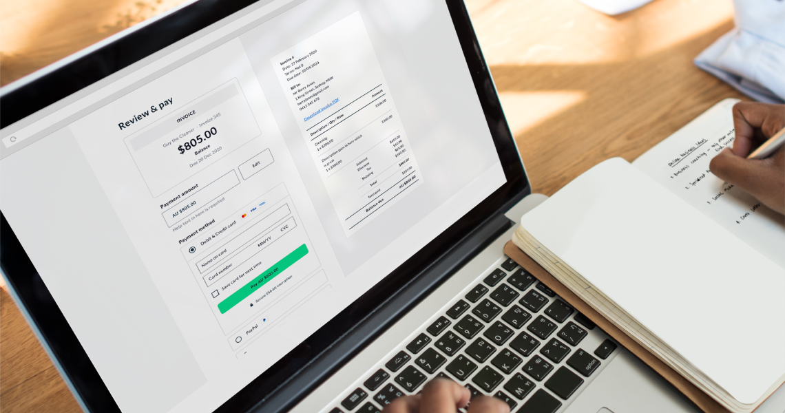
How and when you get paid is crucial to your business. That’s why we’ve been working hard to improve your customers’ experience when they pay your invoices. We’re excited to share the early results from recent Invoice2go, a Bill.com company, payments portal updates that will put money in your pocket faster.
Here’s are our incredible results:
- We enhanced our software to improve transparency and simplify your customer payments. As a result, we saw a 43% increase in customer payments on their first portal visit.
- On average, your customers now spend 48% less time on the portal before making a payment. That’s huge!
- Due to our improved error messaging, there have been 20% fewer payment errors.
We’re ecstatic about what these numbers mean for your business. To celebrate this big win, we want to give you a behind-the-scenes look at the design process that made this possible. Read on for an interview with the Product, Design, and Engineering teams that made these improvements possible.
Researching ways to get your invoices paid
What problem were you trying to solve?
Farzan (Product): We wanted to enhance the payments portal. We saw many opportunities for improvement through user testing, analysis, and surveys.
Guy (Design): We didn’t know the design problem we were solving at the beginning. We knew we could make some general improvements. It wasn’t until we started talking to customers and getting feedback that we saw what needed work. It turned out that lots of small things needed work.
Arjun (Engineering): Our focus was to enhance the app’s architecture to enable quicker iteration and speed up feature delivery. Over time, we found many areas of improvement. We ended up rewriting the whole application from the ground up and launching a new design.
What was the primary goal?
Farzan (Product): We wanted to improve the client portal and align it with industry best practices for user experience and design.
Initially, we were very short-sighted and only thought about how quickly an invoice is paid from the moment it is sent. However, we soon started to broaden this view and discovered these 4 essential metrics:
- The average time to make a payment. Reducing this would mean that your customers have the information they need and can successfully make a payment the first time around.
- The rate of payment error. This meant preventing errors we could control.
- The number of your customers who successfully make a payment after a failed attempt. This means helping your customers know why a payment failed – like insufficient funds on a debit card.
- Overall user experience. One way of improving the user experience meant that your customers could achieve the specific tasks they set out to do. For example, finding a PDF copy of an invoice or viewing the details of an invoice.
Guy (Design): We wanted to create a robust and easy to use portal experience on mobile and web devices. Specifically, we wanted to increase the invoice email open rate, portal pay rate, and the customer’s speed to pay while reducing any flow errors.
Arjun (Engineering): From an engineering standpoint, our primary objective was to improve the application’s performance and stability. On top of that, while architecting the application, our primary consideration was to have the ability to easily add and update payment providers, ensuring compliance with all payment and security regulations.
We also wanted to improve how we handled payment failures, ensuring we provided your customers with information that would be helpful.
What did the process look like?
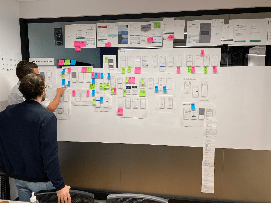
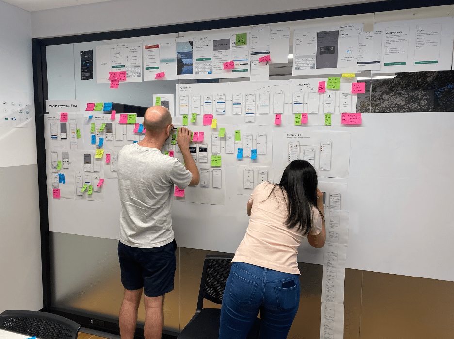
Guy (Design): Looking at the current pay portal flow. We started with printing up all the web and mobile payment flow screens that our customers see. Afterward, we went through the flow and got help from the wider team to ask and answer questions about every aspect of it. Our goal was to fully understand the current payment flow.
Stakeholder interviews. Farzan and I then interviewed around eight Invoice2go stakeholders to get a better idea of the project and the heart of the problem. This was our chance to get a better context and make sure that everyone was aligned.
Existing research. We dug into existing research the research team had already done to uncover potential areas to improve.
Usability testing of the existing portal flow. Farzan and I then moderated usability testing for about 20 external stakeholders across Australia and the United States. We wanted to find out how people interacted with the portal. This uncovered lots of great insights that laid the foundation for the experience redesign.
Analytics. Farzan also did a tonne of work with Glenn, who manages data and analytics, to find out what is going on with the current payments flow data. He spoke with our Customer Success team to get lots of useful direct feedback.
Looking at the competitors + other payment flows. We looked at what competitors are doing as well as other payment flow providers such as Shopify. This allows us to examine what works well and what’s best practice for a payment flow.
Researching with Hotjar. This allows customers to leave feedback while they’re in the process of making payments. This was very powerful and allowed us to get information on what was happening with the customers in real-time as they used the portal.
All this information we’d researched was collated and organised into chunks. It allowed us to see what areas we needed to focus on clearly.
Narrowing down Invoice2go payment portal design ideas to the one that works best
Guy (Design): At this stage, I work with design, research, engineering, and product to get to a place where we are happy to start development work.
The design ideation phase starts with collecting my thoughts on everything we’ve learnt. I do simple, quick designs and get feedback from different team members. This is a messy period in the design process when anything and everything is fair game. Generally, at this point, we go wide with ideas and then get reined into something that works well for the customer.
Once I have a clear direction, I start working closely with engineering to ensure what I want to design is possible from a technical perspective.
I work closely with Darcy, our UX Writer, to ensure the words on each screen fit, make sense, and easily translate into the 11 languages we localize into.
There is a tonne of back and forth. Everyone gives opinions on my ideas. Once I’m happy – which I never am – I do the high fidelity design so that engineering can bring it to life. I then work with Farzan and Arjun to ensure we’re all on the same page.
Engineering the project to life
Guy (Design): Farzan creates user stories that I add my designs to. This is so that Arjun and Yating can marry these things together and develop the correct interactions of the full payments flow.
The engineering part is like working on a car. The engine needs to run right, and the body needs to look and work as it should. Arjun, myself, and Yating go back and forth a lot at this stage. We find little unforeseen problems we need to solve on the fly.
Once all the engineering work has been done – it’s never done – Dya, our QA Engineer, makes sure all the payment flow works as it should. I, on the other side, make sure all the developed work matches my designs.
Releasing and testing the new Invoice2go payments portal
Guy (Design): We then release to a small % of our customers. Farzan keeps a close eye on the early figures. There’s a nervous tension in the early stages. Any adverse effect can be painful for our customers – which we don’t want.
If figures look encouraging. As a team, we’re super happy that it is going in the right direction. Glenn, who manages data and analytics, is terrific at helping Farzan keep a close eye on the crucial metrics.
As we release to more customers, I start doing unmoderated testing on both the old and the new payments portal with people in Australia and the United States. This is so we can benchmark the improvements between old and new.
Guy (Design): This whole process is kind of like a relationship. To make it work, we need to learn, listen, help, and compromise with each other.
Once we do all this, it allows us to get the best possible product out. In this case, the squad had a great relationship. We worked very well together and ended up with a fantastic result.
Diving deep into customer and competitor analysis
What did you learn from speaking to people who regularly pay online invoices?
Farzan (Product):
The standouts for me were:
- Customers usually receive an invoice via email. Providing context and conveying legitimacy were essential elements when it comes to email communication.
- Customers want to have proof of payment. Even though we did share this with them via email, it wasn’t clear to most that we did this post-payment.
- Simplicity is best. Some of the vital information that a customer would want to see on an invoice was hard to find on the old payments portal.
We also sent out a survey that received thousands of responses. As we grouped these responses into themes, it became clear that there were common pain points that needed to be addressed.
Guy (Design):
- People want to receive an invoice email they can trust. Different countries have different preferences on how they prefer to pay.
- People want to see what they’re paying for upfront before they commit to paying. If you make this hard for them, payment will be received more slowly or not at all.
- People want to know that they’ll get a receipt to confirm payment.
- Transaction fees can annoy people. Being transparent is essential.
- If an invoice cannot be paid with a credit card or Paypal, people need to see an alternative quickly.
- People love to leave feedback for the person they’re paying. They love to say thanks for the product or service if they were happy.
What did you learn from other brands?
Farzan (Product):
The key learnings were:
- Don’t overwhelm them with too much information.
- Reduce friction to allow the customer to make payment easily.
- Ensure customers have all the information they need to make payments.
Guy (Design):
- There’s a standard way people like to pay online.
- Good payment flows are simple and clear to the user.
- Give the customer the information they need to feel comfortable.
- The more friction in the journey, the less likely the customer will pay.
- Security is important.
- Be transparent about all fees.
Landing on a solution that works
How did you reach the final design?
Farzan (Product): Once we concluded our research and analysis of user feedback and analytics, we came up with a shortlist of pain points to address:
- Make it easier to find the invoice details
- Simplify finding the PDF version of the invoice
- Communicate clearly about online fees
- Make the payment flow simple and easy
- Clearly communicate why a payment error has occurred and what the user can do
- Show any payment instructions that the business has
- Allow your customer to contact you easily
- Let your customer know they will receive a receipt after paying
By addressing those key pain points, we made the portal more comfortable to use, understand, and trust. Resulting in your customers being more willing to make payment with less hesitation.
Guy (Design): We took all the research and married it to how people like to pay. We went crazy with ideas and worked closely with design, product, and engineering to make sure we’re all aligned. Then by magic, out popped a brand spanking new payment portal, which works amazingly well.
What’s your favourite thing about the new design?
Farzan (Product): We communicate more information while making the portal even more intuitive and straightforward.
Guy (Design): It’s simple and gives people all the information they need to make payments quickly.
Arjun (Engineering): My favourite part of the design is the new and improved digital invoice. It’s simple and minimal yet delivers all the necessary information to the user at a glance.
Related Articles
How to accept credit card payments on Invoice2go in 3 simple steps
Accept payments online via Apple Pay and Google Pay
Must-not-miss write-offs as you wrap up 2022 year-end finances
5 ways accepting credit and debit card payments helps your business stay resilient

4 easy ways to increase cash flow today

What is Small Business Saturday and why is it important?
The features and surprising benefits of a well-designed packing slip
